Since the outbreak of the Corona virus, many regions have seen strict lockdown, curfew or other movement restrictions. These restrictions lead to substantial reductions in traffic, particularly across cities where normally low air quality is a contributor to poor health.
Satellites are well suited for monitoring of such environmental impacts. The recently launched Sentinel-5P TROPOMI is the most powerful air quality sensor in orbit.
With a resolution as high as 7 km × 3.5 km, it has the potential to detect air pollution over individual cities. We have used TROPOMI nitrogen dioxide (NO2) data (filtered for clouds) to monitor changes over many regions of the world since the Coronavirus outbreak. NO2 is a harmful air pollutant and a powerful tracer for air pollution. NO2 is primarily emitted by combustion processes, such as road transport or power generation.
However, satellites observe the tropospheric column and in particular there is sensitivity throughout the boundary layer not just at the surface. The observations are also sensitive to clouds, i.e. the chosen amount of cloud filtering of the data has an impact on derived averages. While the observations are sensitive to changes in emissions, as for in situ observations, one needs to be careful in using data only for interpretation of temporal changes due to the impact of meteorology (including wind dilution), sampling bias to certain days and photochemistry.
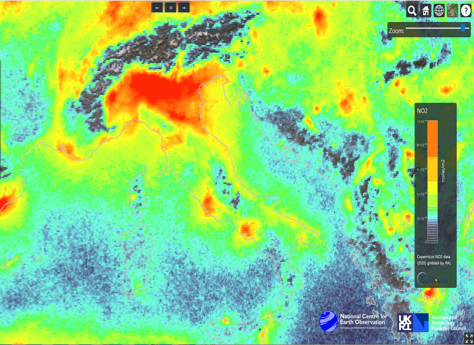
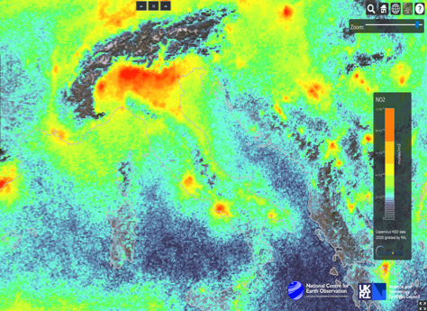
Satellite NO2 over the UK
As the UK often experiences significant cloud cover, so individual days may be subject to large data gaps, our analysis is mostly based on maps averaged over a time period or time series averaged over a region. Figure 1 shows 2-weekly maps derived from TROPOMI NO2 data over the UK between mid-March (beginning of lockdown) and mid-April for 2020. For comparisons the same time period is shown for 2019.
The satellite NO2 data shows substantially lower concentrations in 2020 compared to 2019, especially over major urban centres. There are also decreasing NO2 values as the 2020 lockdown period proceeds through April 2020, most noticeably over London. Similar behavior is seen by other instruments (e.g. the GOME-2 instrument in a morning orbit, which has lower spatial resolution (40 km x 80 km)), providing confidence in the TROPOMI observations. However, it is important to remember that meteorology (winds, cloud cover), will also play a role determining the atmospheric NO2 distribution and its variability which needs to be further analysed.
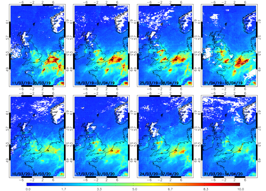
Figure 1: Two-weekly mean tropospheric column NO2 (1015 molecules/cm2) from TROPOMI for mid-March to mid-April 2019 (top) and 2020 (bottom). A quality flag of qa>50 together with a (radiative) cloud flag cf>0.2 has been used (Credit: R. Pope, NCEO-Leeds).
Another contributing factor to NO2 variability is trans-national transport (advection). At NCEO, we have developed tools for routine near-real time visualisation of satellite datasets together with wind data (Figure 2) which is a powerful tool to support the analysis of satellite NO2 observations. The example given in Figure 2 is for easterly wind conditions where emissions from the Netherlands and Northern Germany will impact UK concentrations.
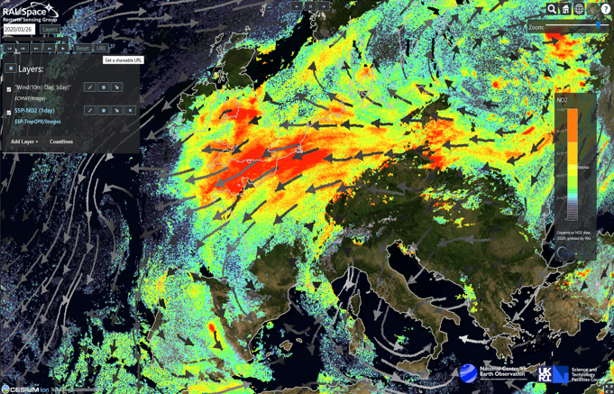
Figure 2: Near-real time visualisation tool for TROPOMI NO2 together with wind data from ECMWF. The example given is for the 26 March 2020 (Credit: B. Kerridge, NCEO-RAL).
Satellite NO2 over cities
Satellites provide large spatial coverage but for any particular location data is sparse. This is therefore the case for urban areas (e.g. London and Manchester, Figure 3) which can make direct interpretation difficult. Figure 3 compares daily satellite NO2 column observations to in-situ concentration data averaged over the cities (provided by James Lee, NCAS). Both datasets show a good level of consistency with initial high concentrations on the days directly following the lockdown on 23 March followed by a decrease in concentrations in the following weeks but with substantial variations including periods of very high concentrations (especially over London) caused by the weekly traffic cycle with low values on weekends and changing weather conditions. We observe that, for London, averaged NO2 concentrations can reach values in April as high as pre-lockdown in early March. In Manchester, the data indicates a cleaner NO2 environment in April compared to pre-lockdown. Again, we emphasize that this will be a balance between reduced transport (motor vehicles) and industrial emissions versus photochemistry and wind transport (advection) effects.
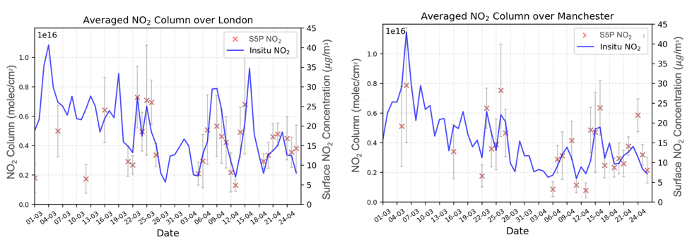
Figure 3: Comparison of daily TROPOMI column NO2 data (left axis, red symbols, molecules/cm2) against in-situ concentration data (right axis, blue line, μg/m3) for a box around the London and Manchester areas for March and April 2020. Both datasets are averaged over the cities. A quality flag of qa>50 together with a (radiative) cloud flag cf>0.5 has been used for the TROPOMI data. Box must have >75% coverage for a daily point (Credit: D. Potts, U. Leicester).

Regions outside the UK:
Below we show results of TROPOMI NO2 for Italy, China and India but have the capacity to look at any region of the globe.
Our most stringent monitoring (high quality, high coverage data) shows a rapid NO2 decrease coincident with the lockdown in China (60-70% decrease) followed by a slow increase since mid-February with now constant values.
In the case of Italy, the decrease is slower and continued over a longer time period with a decrease in concentrations of about 50% compared to the earlier part of the year which has now leveled out
In India, a sharp drop in NO2 is seen around the date of the lockdown followed again an indication of an up-turn in activity
Comparisons of monthly mean maps over Italy and India for April 2020 to the same months of the previous year (2019) does support the observation of unusually low NO2 concentrations in the period after the regional lockdown.
Italy
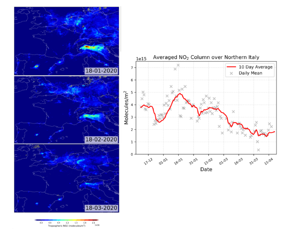
Figure 4: Italy. TROPOMI NO2 maps for 3 representative days (left) and series of NO2 averaged for a box around Northern-Italy (right). Blue line is 10-day smoothing, grey symbols are induvial days. A quality flag of qa>50 together with a (radiative) cloud flag cf>0.5 has been used for the TROPOMI data. Box must have >75% coverage for a daily point (Credit: D. Potts, U. Leicester).
April 2019
April 2020
Figure 5: Italy. TROPOMI NO2 maps for April 2019 and April 2020 (Credit: B. Kerridge, NCEO-RAL).
China
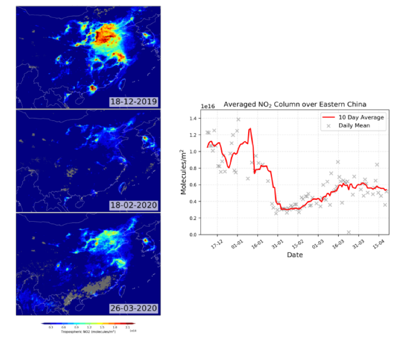
Figure 6: China. TROPOMI NO2 maps for 3 representative days (left) and series of NO2 averaged for a box around Eastern China (right). Blue line is 10-day smoothing, grey symbols are induvial days. A quality flag of qa>50 together with a (radiative) cloud flag cf>0.5 has been used for the TROPOMI data. Box must have >75% coverage for a daily point (Credit: D. Potts, U. Leicester).
India
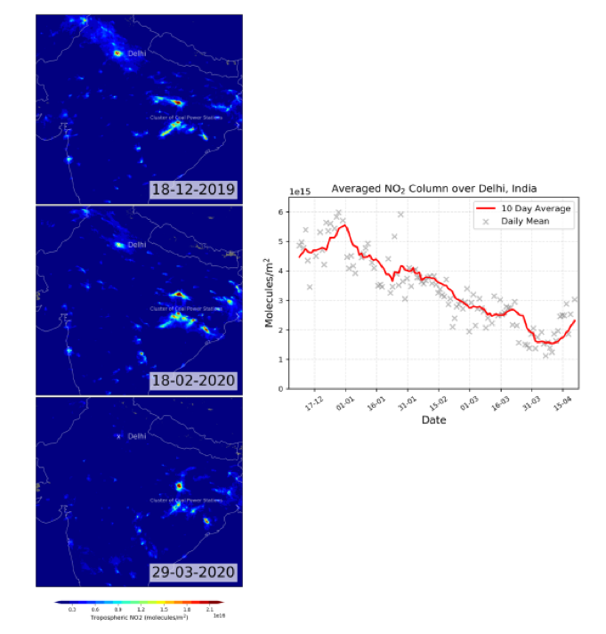
Figure 7: India. TROPOMI NO2 maps for 3 representative days (left) and time series of NO2 averaged for a box around Delhi (right). Blue line is 10-day smoothing, grey symbols are induvial days. A quality flag of qa>50 together with a (radiative) cloud flag cf>0.5 has been used for the TROPOMI data. Box must have >75% coverage for a daily point (Credit: D. Potts, U. Leicester).
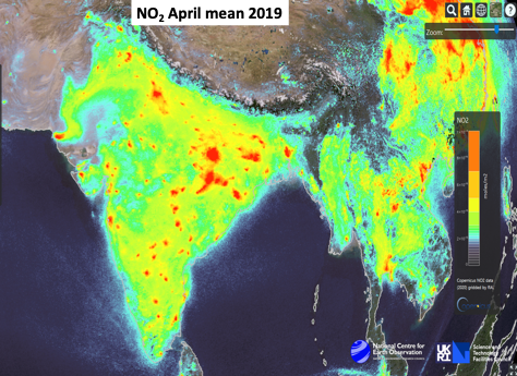
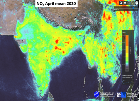
Figure 8: India. TROPOMI NO2 maps for April 2019 and April 2020 (Credit: B. Kerridge, NCEO-RAL).
.